notes and notices are short and curt reviews of exhibitions at (mostly) London galleries.
 Elena Njoabuzia Onwochei-Garcia
Grown: The Altering of Innocence and Experience
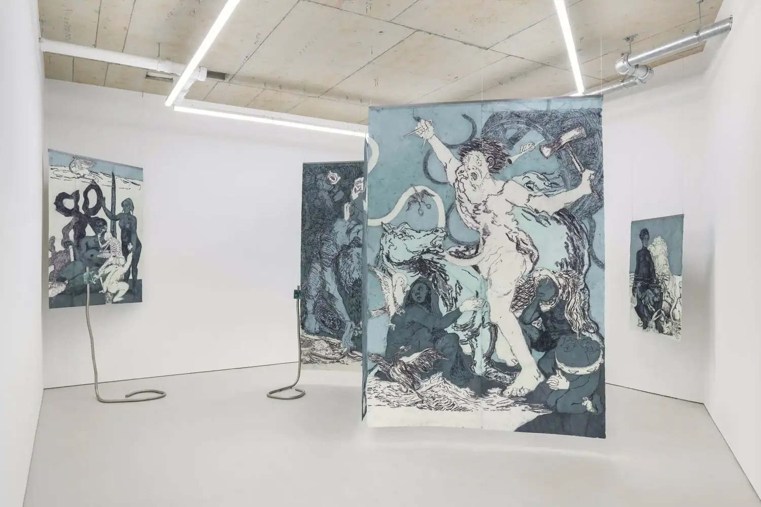
★★★★☆William Hine , LondonOn until 25 July 2026Onwechi-Garcia’s hangings turn the gallery into a night-in-the-museum dream sequence. Her teal pastels and watercolours animate centuries of myth, mixing chronology and provenance. There’s a lifted Blake and maybe a Hogarth, and a paraphrased Goya. A broken Greek vase could be a source here, and that medieval illumination must have taken reverie to copy. These large, floating drawings, having refused their customary framings, break out in storied, fragile opulence.
Such fables are pure pleasure to narrate, yet their wealth of references overwhelms. Does the artist care for the history she dwells in, or does her maze confirm civilisation’s loss inside it? It’s hard to discern this from Onwechi-Garcia’s hand alone. Some of her characters take on a life of their own, others are stilted and composed a little too tightly. A set of Freudian slips —steel snakes, get it? — confuse transmission and fantasy emission.

Flare-Up
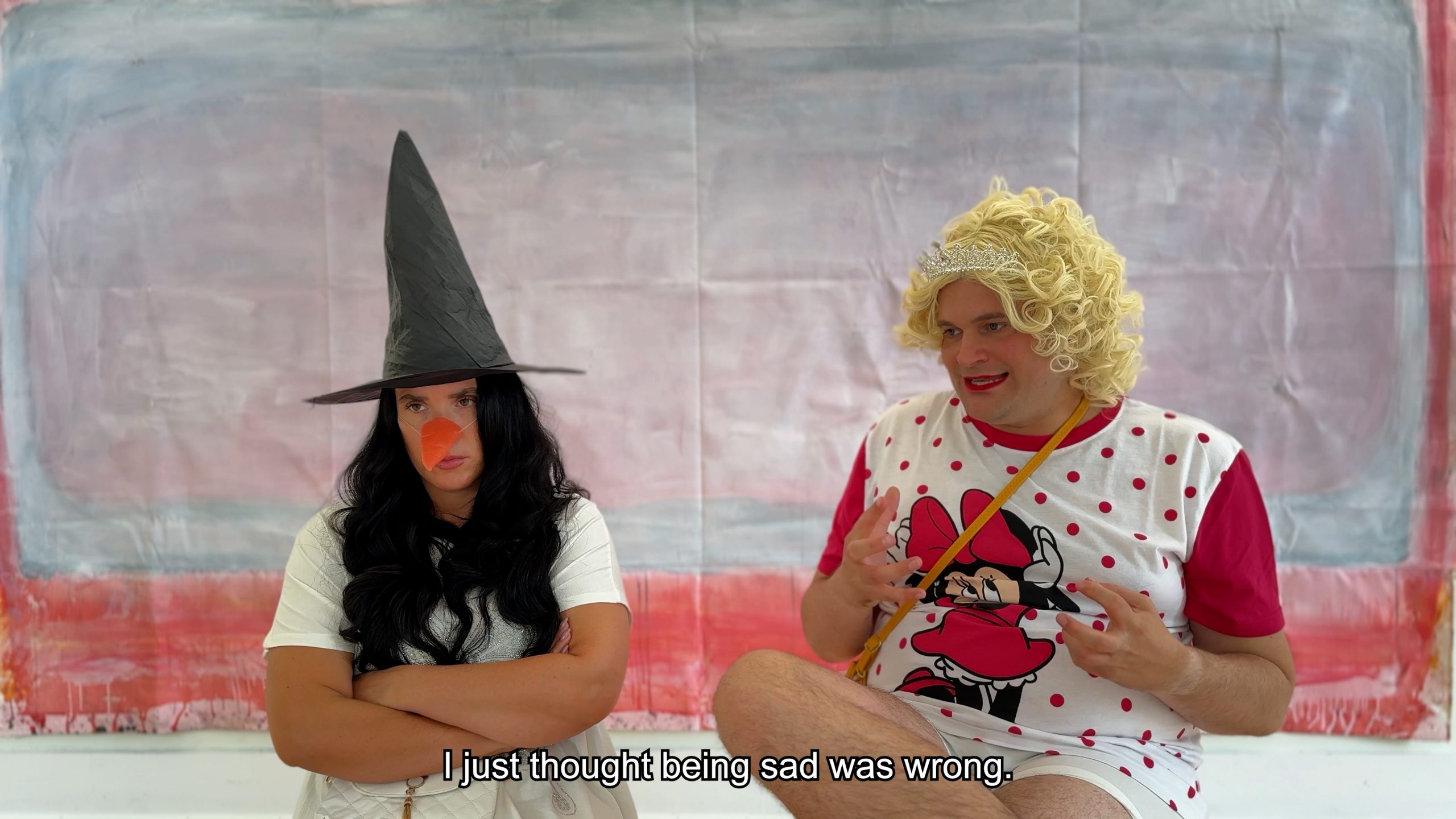
★☆☆☆☆Goldsmiths CCA , LondonCurated by Natasha Hoare, Mariana LemosOn until 16 July 2026It’s staggering that we ever believed galleries might be effective loci for social campaigning. The production of art lags so far behind theory, which, in turn, only slowly distorts political need, that by the time an exhibition speaks to the “poetics and aesthetics of illness”, its only language is cliché.
Whom does it help to find a secondary Felix Gonzalez-Torres (poetic, check) and hang it next to a tertiary Derek Jarman (crassly aesthetic, thumbs down)? These narratives were once productive but gave way to self-sabotage and self-pity. Avril Corron’s IV-bag water chandelier blames her landlord for something, while Bella Milroy’s welfare letters are no Daniel Blake when health claims have sunk the economy.
The social model of disability is that to be unwell is other people’s problem. In projects like this one, it takes on the Romantic notion that consumption makes the artist a truth-seer. A few works resist this: Angela de la Cruz’s sofa and wooden box assembly is art before it is anything else and even Christine Sun Kim has earned her place in the inaudible canon.
But to mix such work with the pseudo therapeutic, pseudo activist babble of the Freestylers is a put-on. The striking academics next door also ask for sympathy because their future “NHS therapists are training here”.
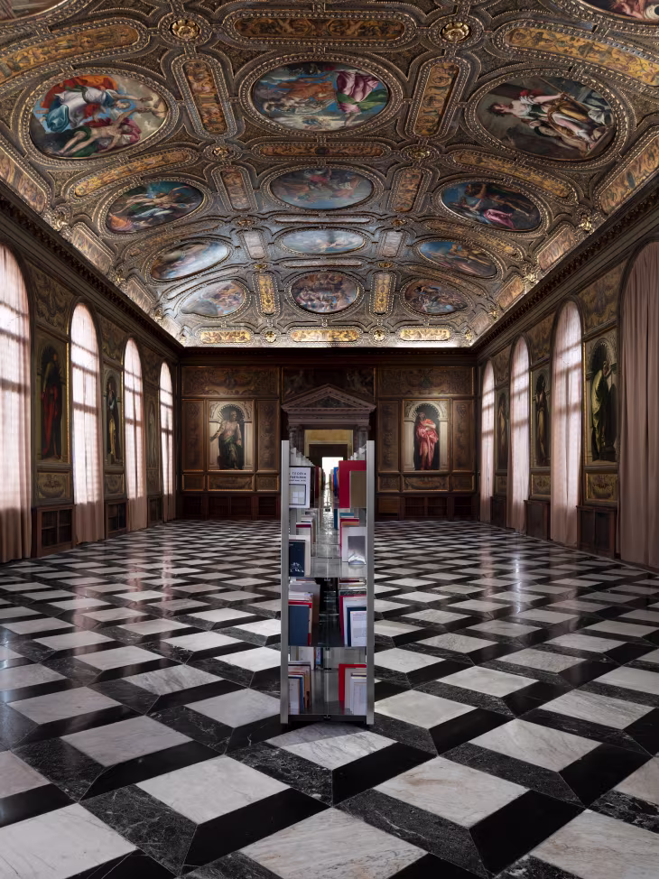

It takes hutzpah to put a row of steel shelves in a fifteenth-century Venetian library, stack them with a bunch of decommissioned library books, and call the job complete. It is another thing altogether that more than half a dozen institutions over a dozen years have joined in Favaretto’s antiquarian act.
The art world art sees its preservation and reproduction in these “Momentary Monuments”. With literacy itself in ostensible crisis, Favareretto’s second-hand salesmanship exposes the museum’s anxiety that the image might soon go the way of the word. Imagine the Louvre a charity shop, then, with Rembrandt and Rothko in the bargain bin, Warhol the stock boy, and Duchamp in the toilet where he always belonged.
Whose expense is this joke at? On redundant paper, Favaretto’s concerns are loftier yet more trite. The pamphlet speaks of “the book as an epistemic infrastructure” and “a critical space for verification and transmission”. Burning the art student’s undergraduate essays won’t solve the problem, alas. Neither will the conceptualist’s iconoclasm.
 Alexander Kluge et al.
The Ear is the Eye of the Soul
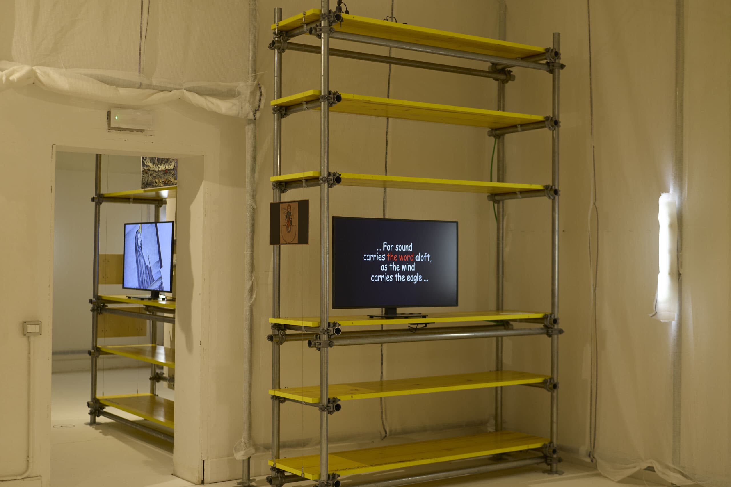
★★★☆☆Holy See pavilion , VeniceCurated by Hans Ulrich Obrist, Ben VickersOn until 22 November 2026Don’t too many priests spoil the soup? The Vatican’s two-curator, two-site, countless-artist pavilion tries to please crowds in the garden and confuses them in the sacristy. The sonic walk installation, with works by Obristian sidekicks cued up to the heavens, is outright trivial. It’s pleasant, granted, to stroll through Venice’s one patch of secluded greenery, but that’d be the case even without wireless headphones. This installation could happen (and has) anywhere; the holy soundtrack’s transcendental pathos is, in this end, entirely generic.
Across the city, Kluge’s dying confession to Hildegard of Bingen is spectacular but by contrast too heavenly to dwell in. Architectural reconstruction hardware, drapery, and sickly yellow lighting turn the church complex into a site of renewal. In it, twelve filmic stations bear the sound of nuns singing, musicological trivia, and interruptions in… Comic Sans. What they narrate God only knows, though. In vain, one waits for this Medieval sonic payload to trump its contemporary counterpart.
 Nina Wakeford, et al.
The Unfinished Business of Living Together
★★★☆☆Swiss pavilion , VeniceCurated by Gianmaria Andreetta, Luca BeelerOn until 22 November 2026This year’s Swiss artistic committee — their project billed unusually as a curatorial device delegated to adjunct research artists — immersed itself in the late-1970s public image politics of homosexuality to draw out its social repercussions on today. Projections taken from television magazine programmes, brought into the twenty-first century with jaggy CGI, narrate the tension and tenderness of civic rights and aesthetic emancipation. Alarmist activist statements serve as the show’s wayfinding. News cuttings point to a sense of peril, while a gay predator shark has triumphantly devoured the patriarchy.
Mission accomplished? Not quite, the wall text suggests. Yet the forms on show do not attest to the project’s cyclical necessity; they merely foreground once vital art’s descent into dry sociology. They please the eye as they do so, granted, but that only makes their demand more pernicious. This call for liberation is bogus! If the Swiss don’t think they’re free, who is?

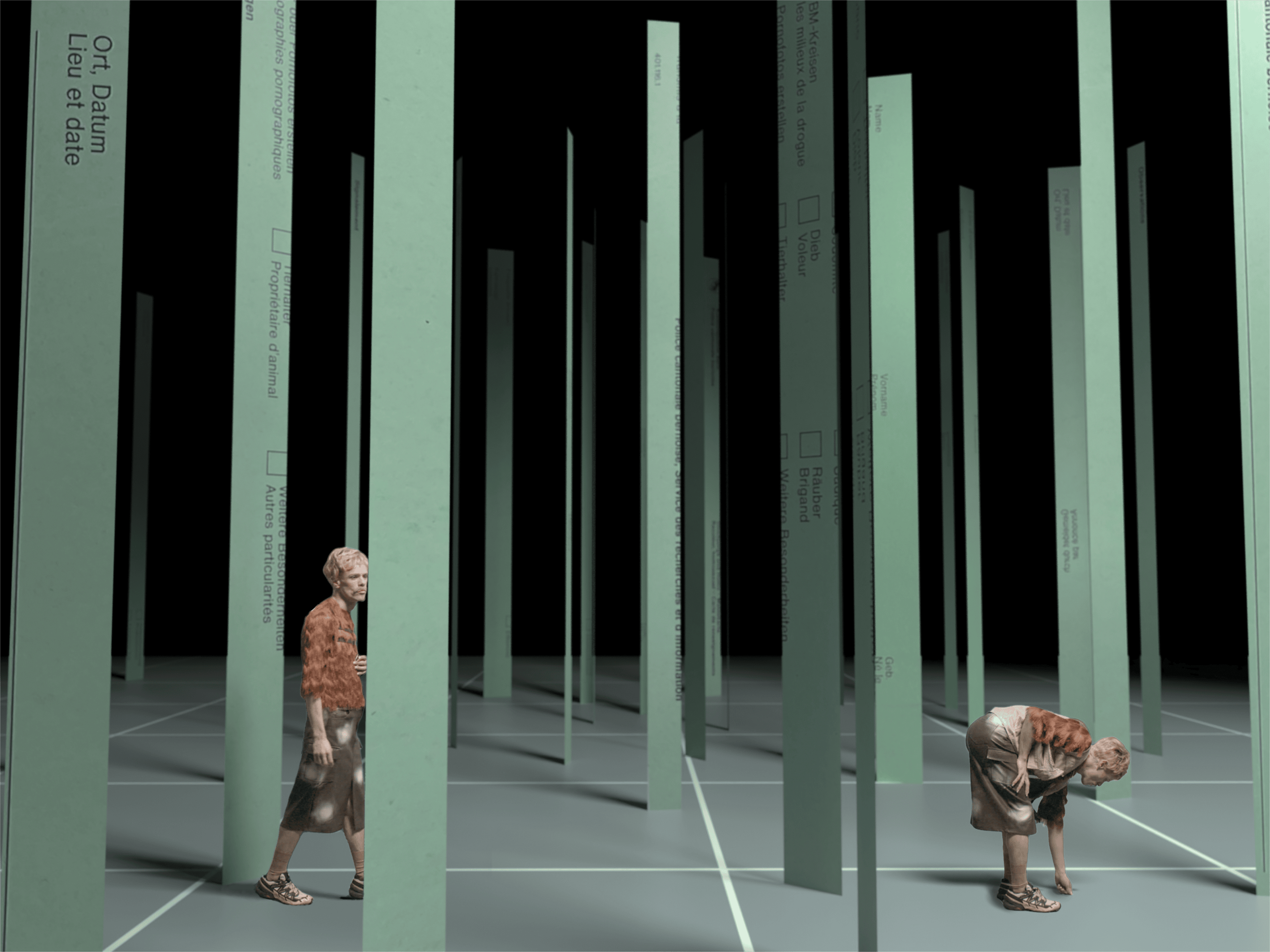
Nomenclature for the Time Being
★★☆☆☆Raven Row , LondonCurated by Imani Mason JordanOn until 6 September 2026Raven Row’s ‘impenetrability as a service’ is becoming tiresome. After Christine Kozlov’s conceptualism left audiences rudderless in a history that’s accounted for with clarity elsewhere, this new salvo proposes that ‘making art while black’ needs theory beyond, but somehow still rooted in the racial strife of the past decade.
This isn’t untrue, perhaps, but nothing on show is this theory or capable of giving rise to it even together. Kellard-Jones’s hanging mattress with heirloom medallion is tender, as are Kilfa’s photographs of the blackness of coffee becoming the blackness of the world. But Kirubo’s multimedia hangings are chaos, obscured further by her Vaseline-smeared windows. Sudipo’s ritual-fetishist leather and Holman’s pulled teeth spread geographic confusion. Hassinger’s Duchampian “love” hanging is full of hot air, while Muholi’s outsize retro telephone is no more than a bad joke. What stories might one need to hear down this line to make sense of these pairings?
Only silence answers. Too often, curating in these galleries foregoes the artefact only to fall back on glossy printed verbiage and high install specs. That is not, however, how good ideas spread.
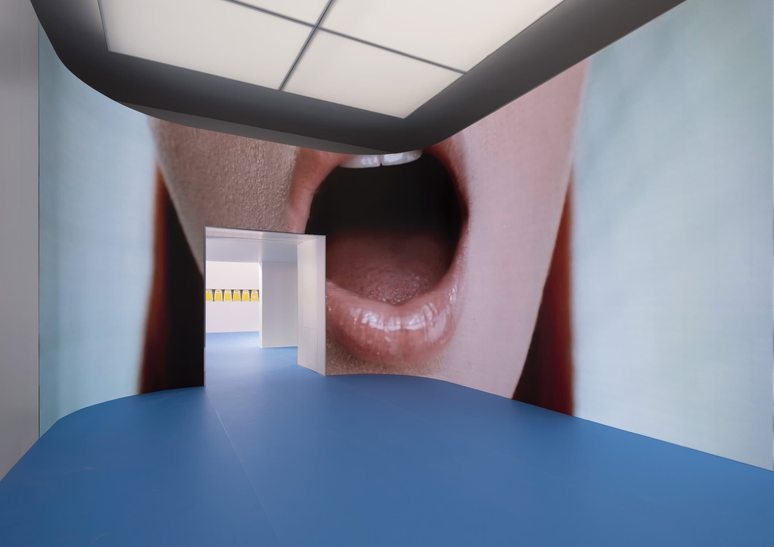
 Maja Malou Lyse
Things to Come
★★★★★Danish pavilion , VeniceCurated by Chus MartínezOn until 22 November 2026Does representation have the power to shape its object? The answer was once obvious, but in today’s image-saturated culture, as the hackneyed phrase goes, to deal with the icon takes conviction. Lyse throws caution to the wind, confronting the image’s epigenetic consequences.
In clinically pornographic surround, the installation takes the classic female nude to its inevitable conclusion. If titillation was once the stuff of oil paint and the top-shelf magazine, the gallery now delivers it in OnlyFans perfection. Lyse’s barely clad women flex for the cameras, their poses optimised for maximum NSFW spell-bind. Ciccolina, the icon’s icon, performed at the show’s opening. No man’s desire has not been shaped by these apparitions.
In this barely fictional post-sex world, intercourse is a game of image veneration, its object divorced from old biological imperatives. Lips, tits, and cunts are the world, but men “race” their sperm under the microscope for kicks. IVF is GDP, and love is in surplus. In a Biennale under the spell of a dead woman, Lyse’s contribution is as morbid as it is vital. Eros is dead. Long live Eros.

 Li Yi-Fan
Screen Melancholy
★★★☆☆Taiwanese pavilion , VeniceCurated by Raphael FonsecaOn until 22 November 2026Taiwan has form in staging depressing video installations next door to the Doge’s palace. This year’s contribution is an orgy of flesh, both on screen and at hand. Li’s animations follow a tribe of sketchily rendered humanoids as they engage in an operatic orgy of misery. The drama unfolds as the characters lose themselves in screens-within-screens, their masturbatory narrations performed from a cyclical script.
That’s the catch, though: Li’s characters are puppets, and their unfreedom his choice. The loop they are stuck in might be pure sarcasm. More likely that it’s Taiwanese melancholia.
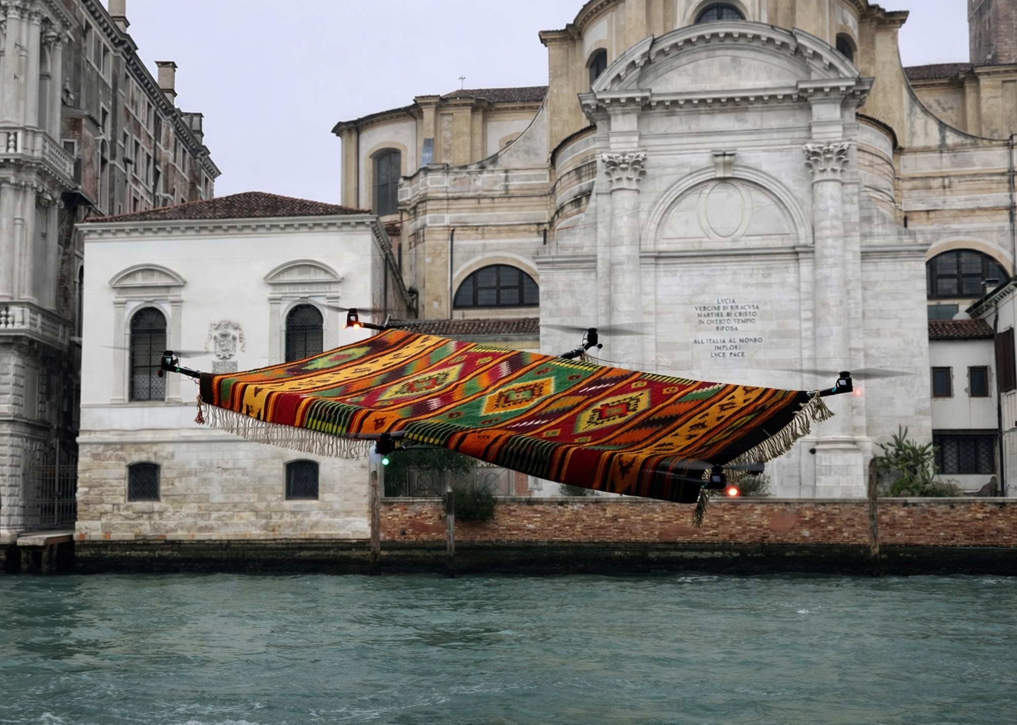
 Pavel Brăila
On the Thousand and Second Night
★★★★☆Curated by Adelina LuftOn until 22 November 2026Who knew that total temporal collapse would manifest magic. Moldova’s first outing in Venice mixes the hackneyed craft of carpet weaving, which one might expect to see in a heritage project of an arriviste nation, with the futuristic might of drones that has become the calling card of China’s techno-cultural displays.
The carpets float in pitch dark, disorienting the audience under with the whirring of motors and gusts of chilling air. With detailed tales from the weavers’ cultures absent, the mind drifts to air warfare that today haunts the lands of a Thousand and One Nights. That we lack the patience for a thousand more is only a pity.
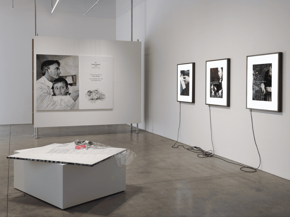
 Jenna Bliss, Buck Ellison, Jasmine Gregory
Genuine Fake Premium Economy
★★★☆☆ICA , LondonOn until 5 July 2026Reorienting contemporary art to questions of labour and class, as this exhibition purports to, would be outright reactionary. Elsewhere, even the queer and post-colonial revolutions are already passé, having made no one’s life better. What would it take, hypothetically, for a struggling artist to take control of the means of aesthetic production?
That is not the aim of Genuine Fake Premium Economy, however. Gregory’s oil renderings of Patek Philippe adverts set the tone, pointing to other people’s desires as the object of capital. Ellison’s sparse arrangement of office paraphernalia calls for aesthetic refusal and has a feel of American Psycho to it, granted. But his wealth management graphics link art and capital in an entirely different manner.
Bliss’s pre-2008 art fair satire flic, by contrast, is well observed, funny, and well cast. Yet it, too, understands art in terms the contemporary can no longer bear. Together, these slight objects only obfuscate, promoting despite themselves indulgent, out-of-date theories.
Inspired in form and attitude by Manhattan Art Review.